What is data visualization?
- Data visualization is not just pretty charts.
- It’s about showing the right data in the right way.
- Good visuals make complex research easy to understand.
This guide helps you choose the best chart for your story.
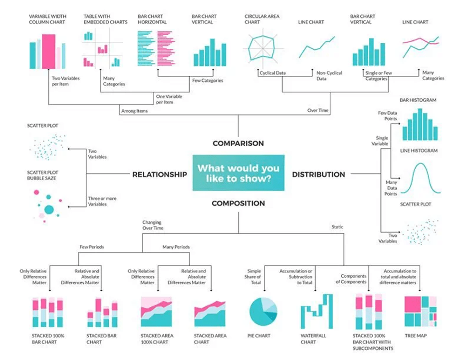
Types of Data Visualizations
1. Comparison
Used to show how things differ or relate.
- Variable Width Column Chart – Compare two values per item.
- Table with Embedded Charts – View many values side by side.
- Bar Chart (Horizontal) – Best for many categories.
- Bar Chart (Vertical) – Good for few categories.
- Circular Area Chart – Ideal for cyclical trends.
- Line Chart – Show change over time, simple or many lines.
2. Relationship
Used to explore how variables are connected.
- Scatter Plot – See how two values relate.
- Bubble Chart – Add a third variable using bubble size.
Want to write your research paper 10x faster?
Meet Jenni AI – Your FREE AI-powered academic writing assistant.
Used by 4M+ researchers, Jenni AI helps you plan, write, and cite your entire paper – in just minutes.
What can you do with Jenni AI?
➤ Create paper outlines based on your topic in seconds
➤ Upload and cite papers from your library with 1 click
➤ Get real-time sentence suggestions as you write
➤ Automatically generate in-text citations and reference lists
➤ Use AI commands for counterarguments and rewrites
➤ Export your paper in Word, LaTeX, or plain text formats
Check it out here: www.jenni.ai
3. Distribution
Used to understand how values are spread out.
- Bar Histogram – Show distribution of a single variable.
- Line Histogram – Show smoothed distribution patterns.
- Scatter Plot – Reveal patterns with many data points.
4. Composition
Used to show parts of a whole.
Dynamic (Over Time):
- Stacked 100% Bar Chart – Show relative parts over time.
- Stacked Bar Chart – Show both size and value changes.
- Stacked 100% Area Chart – See relative growth trends.
- Stacked Area Chart – Compare total and part changes.
Static:
- Pie Chart – Show simple share of the total.
- Waterfall Chart – Show how values add/subtract to total.
- Stacked Bar with Subcomponents – Show layers within parts.
- Tree Map – Show size and value within nested categories.
10 Simple Tips to Pick the Right Chart
- Start with the question you want to answer.
- Use bar charts for comparisons.
- Line charts are best for trends over time.
- Use pie charts for simple proportions only.
- For complex parts, try a stacked area or tree map.
- Scatter plots are great for patterns and outliers.
- Use bubble charts when size matters.
- Choose histograms for data distribution.
- Avoid 3D charts—they confuse more than help.
- Keep it clean and readable. Less is more.
That’s it! Next time you visualize, let the data pick the shape.
Use this image as your cheat sheet for all research visuals.
Save it. Share it. Use it in your next paper or presentation.
Check out my YouTube video on how to get a scholarship.
Video link: https://www.youtube.com/watch?v=0BJ9GodhdKY
Don’t forget to read: 10 Simple Ways to 10x your PhD Productivity
YouTube Channel: www.youtube.com/@DrFaheemUllah

Find me on Youtube